Unified Continuity
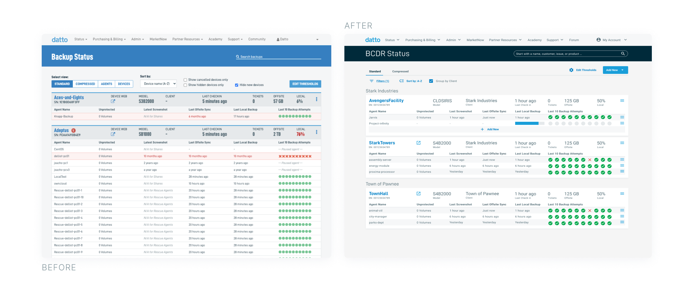
A new Status Page


Unified Continuity
A new Status Page

The BCDR (business continuity and disaster recovery) status page is where our users start their day, it informs their to-do list. Partners get a surface-level view of their device’s health, it's the heartbeat of the partner's fleet. The launch of Datto Continuity for Microsoft Azure (DCMA) provided an excellent opportunity to reflect on the overall experience of the BCDR Status page.
Today, our users face an outdated UI that results in lots of scrolling to find issues that need attention. We want to make it more efficient and help communicate the value Datto brings
Ensure a largely unified experience for DCMA & BCDR
Increase efficiency by making it easier to find what they need and complete tasks
Move beyond just operational tasks and help communicate value
If we’re successful we will see
Shorter time to action
Fewer Support tickets
On this project, I was the sole UX designer in charge of each stage of the design process, including facilitating user research. I established the business case and obtained buy-in for the project. In addition, I helped lead design-driven strategy and roadmap initiatives.
A heuristic evaluation was conducted to launch the project and identify areas that needed improvement. From there, we came up with features that could serve as a potential solution for areas where the page fell short.
| Potential Improvement | Design/Feature Concept |
|---|---|
|
|
|
|
|
|
|
|
Users of the status page are divided into two groups: technical users and business users.
Technical users check the BCDR status page daily to monitor the health of their fleets.

Business users check the BCDR status page weekly to generate high level reports.

I conducted 15 interviews, of which 13 were with partners, 1 with a large client user, and the final one with an internal Datto user. Participants praised the improvements made to the page and expressed their approval of the new designs and features, describing them as quality of life enhancements.

Needs Attention (9 participants)
Restore Running (8 participants)
Appearance (6 participants)
Too much white space (3 participants)
Having to expand cards to see more details (3 participants)
Last 10 backup summary (2 participants)
*not every participant was able to name a concept they did not like
“Everything about this covers a lot of my major complaints. Large quality of life upgrades”

Needs Attention Section
Make sure we cover every day, not just critical issues
Introduce a level of customization
The ability to ignore alerts, thresholds at the device level, etc
Include some form of prioritization of issues color coding, symbol, etc
Golden Gate Design System
Remove some white space vertically
Responsive design for larger monitors/screen resolution
Explore options for client name
Restore Running Badge
Could be its own tab on the same card as Needs Attention
Click on the badge and bring you to the current restore in RL2
Increased Efficiency, Communicate Value
"Needs Attention will deal with a lot of the problems, I didn't know I wanted it until I saw it"
Communicate Value, Unified UX
"People tend to leave those for days and days and then somebody runs across one and says hey what the heck is this, do you still need this?"
Increased Efficiency, Unified UX
“The spacing is better than the last one I don't know why, but this one seems more open, just more pleasing”

Release Communications
Surveys and Retro Interviews
More Features!
View Next: Golden Gate